In the previous post, we wrote our first Typst document and practiced a handful of the most basic syntax — headings, bold/italic text, and lists. This post keeps going and digs into the text formatting tools you’ll reach for all the time: decoration syntax like underline, strikethrough, and highlight; finer touches like superscript, subscript, and small caps; and customizing font, size, color, and weight with the text function.
None of these are hard on their own, but combining them is what actually gives your writing a sense of layout — it takes some muscle memory to get comfortable with. This post walks through three sections in order — text decoration, custom text styles, and alignment and line breaks — so your Typst document gets more than just a skeleton; it starts having a consistent visual identity.
Text Decoration
Underline, Strikethrough, and Overline
Underline, strikethrough, and overline are the three most basic text decorations, and each maps to its own function: #underline[...], #strike[...], #overline[...]. Just wrap the text you want to decorate in square brackets — no extra setup needed:
1 | This is a line with #underline[underline], #strike[strikethrough], and #overline[overline] text. |
Highlight
To mark something as important, use #highlight[...], which applies a yellow background by default — the effect looks just like an actual highlighter pen:
1 | #highlight[This text is highlighted], and defaults to a yellow background. |
If you want a different color, highlight also accepts a fill parameter — for example, #highlight(fill: aqua)[...] switches it to aqua.
Superscript and Subscript
Scientific notation and chemical formulas often need superscript and subscript, handled by #super[...] and #sub[...] respectively, usually placed right after the text they annotate:
1 | The mass-energy equation can be written E = mc#super[2], and the chemical formula for water is H#sub[2]O. |
Small Caps
#smallcaps[...] converts text into small capital letters, commonly used in headings or to emphasize proper nouns — but the effect only applies to Latin letters and doesn’t affect CJK characters:
1 | #smallcaps[Small Caps] are often used in headings or to emphasize proper nouns. |
Full Example
Putting the four pieces of syntax above together into a single text-decoration.typ:
1 | #set text(font: ("Libertinus Serif", "PingFang TC"), size: 14pt) |
Here we additionally use #set text(font: (...)) to specify a font list: Latin text is set in Libertinus Serif first, falling back to PingFang for CJK characters1.
After compiling with typst compile, here’s the result:

Custom Text Styles
We already used #set text(...) once earlier, to set the default font and size for the whole document. This section covers other commonly used parameters of the same text function: font, size, color, weight, and style — and it’s not limited to #set-ing the whole document; you can also wrap just a small piece of text to apply it locally.
#text(...)[...] has two kinds of brackets:
(): holds named parameters — things likefont,size,fill— written askey: value, with multiple parameters separated by commas;[]: holds the actual content, which can be a piece of text or other markup content.
Font and Size
#text(font: "...", size: ...)[...] lets you swap the font and size for just the text it wraps, without affecting anything else in the document:
1 | #text(font: "Heiti TC")[A sentence set in a different, sans-serif font.] |
Picking a Font
In the terminal, typst fonts lists every font name the system can currently find — copy and paste any name straight into the font parameter. You can also pipe it through sort2 to sort the output:
1 | typst fonts | sort |
On the author’s machine, this lists 482 fonts in total; here are just the first five and last five after sorting:
1 | Academy Engraved LET |
If you’re using the typst.app online editor, the toolbar has a ready-made font dropdown, so you don’t need to look up names yourself. If you can’t find a font you like, you can also download one from Google Fonts, install it on your system, and use it the same way.
Size Units
size takes a length value. Typst supports the following length units, and pt is the one most commonly used for text size:
| Unit | Description | Example |
|---|---|---|
pt |
Points | 12pt |
mm |
Millimeters | 254mm |
cm |
Centimeters | 2.54cm |
in |
Inches | 1in |
em |
A multiple of the current font size | 2.5em |
Color
The fill parameter controls text color. You can use a built-in color name directly (like red or blue), or specify a custom color code with rgb("#..."). For example:
1 | #text(fill: red)[Red text] |
or:
1 | #text(fill: rgb("#0074D9"))[Blue text with a custom color code] |
Besides the built-in color names, Typst also supports several color models for specifying colors directly. Here’s what each one means and how to write it:
| Model | Full Name | Concept | Typst Syntax Example |
|---|---|---|---|
| HEX | Hexadecimal | Represents a color as a hexadecimal code — the most common format in web design | rgb("#0074d9") |
| RGB | Red Green Blue | Additive color mixing by stacking red, green, and blue light channels, values 0–255 (or percentages) — used for screen display | rgb(0, 116, 217) |
| CMYK | Cyan Magenta Yellow Key | Subtractive color mixing by stacking cyan, magenta, yellow, and black ink, values as percentages — used for print output | cmyk(100%, 47%, 0%, 15%) |
| HSL | Hue Saturation Lightness | Describes a color by hue, saturation, and lightness — closer to how people intuitively pick colors | color.hsl(208deg, 100%, 43%) |
All four of the lines above actually describe the same shade of blue — which one to use in practice depends on the situation3.
If you already have a color in mind — say, from an image or a design file — but don’t know its color code, you can upload the image to imagecolorpicker.com and pick the color directly. Once you have the hex value, just drop it into rgb("#...") instead of guessing.
Weight and Style
Weight refers to how thick a character’s strokes are — the higher the number, the heavier the strokes. Keep in mind that not every font provides all nine weight levels; when a font doesn’t have the exact weight you asked for, Typst automatically picks the closest match instead:
| Named Weight | Value |
|---|---|
"thin" |
100 |
"extralight" |
200 |
"light" |
300 |
"regular" |
400 |
"medium" |
500 |
"semibold" |
600 |
"bold" |
700 |
"extrabold" |
800 |
"black" |
900 |
The weight parameter accepts a number from 100 to 900, or one of the named weights in the table above. Let’s start with a lighter weight:
1 | #text(weight: "light")[Light weight text] |
And going the other way, a heavier weight uses the exact same pattern:
1 | #text(weight: "bold")[Bold weight text] |
If nine named levels aren’t precise enough, you can skip the names and use a plain number to land somewhere between bold and normal — something plain *bold* syntax simply can’t do:
1 | #text(weight: 500)[Somewhere between bold and regular (weight: 500)] |
Alongside weight, style controls italics or oblique, taking either "italic" or "oblique":
1 | #text(style: "italic")[Italic text] |
Full Example
Putting font, color, weight, and style together into a single text-styling.typ:
1 | #set text(font: ("Libertinus Serif", "PingFang TC"), size: 14pt) |
After compiling with typst compile, here’s the result:

Alignment and Line Breaks
The previous two sections were both about adjusting the text itself locally. This section zooms out a level, looking at where content sits on the page as a whole: where it’s aligned, when to break a line, and when to start a new paragraph.
Text Alignment
align controls where content is positioned. You can apply it to the whole document with #set align(...), or wrap just one piece of content with #align(...)[...] to apply it locally. Horizontal and vertical keywords can be combined with +, like right + bottom:
| Keyword | Axis | Description |
|---|---|---|
left |
Horizontal | Aligns to the left |
center |
Horizontal | Centers |
right |
Horizontal | Aligns to the right |
start |
Horizontal | Aligns to the language’s starting edge (same as left in left-to-right languages) |
end |
Horizontal | Aligns to the language’s ending edge (same as right in left-to-right languages) |
top |
Vertical | Aligns to the top |
horizon |
Vertical | Centers vertically |
bottom |
Vertical | Aligns to the bottom |
1 | #align(center)[A centered line] |
If the whole document (or a long stretch of content) needs the same alignment, instead of wrapping #align(...)[...] around every single block, you can just set it once with #set align(...) — everything after it will follow that setting without needing to be wrapped:
1 | #set align(center) |
One thing to note: align is a block-level setting, and applying it immediately breaks the current paragraph — you can’t use it to align just a few words in the middle of a sentence4. Paragraph-level details like justification and first-line indent belong to the par function, and we’ll cover those together in a later post.
Line Breaks
How a line break looks in your Typst source doesn’t always match how it renders on the page:
| Syntax | Effect |
|---|---|
| A blank line | Starts a new paragraph |
| A single line break | Ignored, treated as a single space — produces no visible line break |
\ followed by whitespace |
Forces a line break within the paragraph, without starting a new one |
#linebreak() |
Same effect as \, written as a function call — you can additionally pass a justify parameter to control whether the line is justified before breaking |
1 | This line ends with a backslash, \ |
Full Example
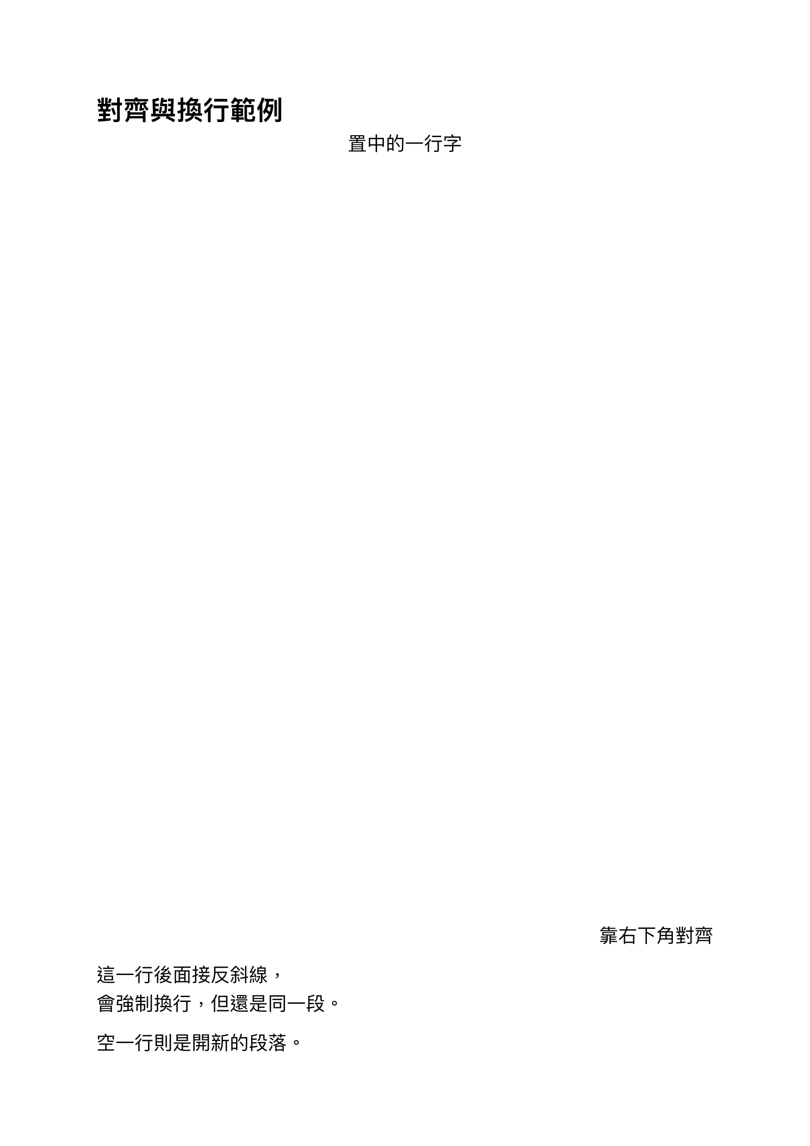
Putting alignment and line breaks together into a single text-alignment.typ:
1 | #set text(font: ("Libertinus Serif", "PingFang TC"), size: 14pt) |
After compiling with typst compile, here’s the result:
Summary
This post ran through Typst’s most basic text formatting tools: decoration syntax like underline, strikethrough, overline, highlight, superscript/subscript, and small caps; customizing font, size, color, weight, and style with the text function; and finally using align to decide where content sits, plus \, #linebreak(), and blank lines to control line breaks and new paragraphs. These bits of syntax will keep showing up in almost every post from here on, so it’s worth getting comfortable with them now. Next up, we’ll move toward structure and cover lists and links — syntax you’ll reach for constantly!
See you next time~
Code for this post: day03-text-formatting
1. Typst’s default font (Libertinus Serif) doesn’t have glyphs for some CJK characters (like “黃”), which also breaks decorations like underline and overline — without specifying a font list, you’ll see a tofu box on screen instead. Adding a common system CJK font (like PingFang TC) to the font list as a fallback fixes both the missing glyph and the broken decoration lines at once. ↩
2.sortis a common terminal sorting command that re-orders the output of the previous command alphabetically.typst fontson its own doesn’t necessarily output fonts in alphabetical order, so piping it through| sortis just for readability and easier comparison — it has no effect on whether a font actually works. ↩
3. Simple rule of thumb: for web and on-screen content, HEX or RGB is the usual choice; for anything going to print, you need to think in CMYK; and for adjusting colors by feel — like shifting the shade within the same hue — HSL tends to be easier to work with. ↩
4. If you wrap a few words in the middle of a sentence with #align(center)[...], Typst won’t center those words in place — it breaks the paragraph and opens a separate block to center that content, while the text before and after keeps its original layout as its own paragraph. ↩